Hio Furniture Line
Designed by: Brendan Byrne & Suzi Biehl
Hio is an award winning furniture concept for a contest sponsored by Room&Board. My partner and I designed a furniture line to fit their current product lineup. Hio utilizes innovative materials, fills a gap in the existing Room&Board lineup, and flaunts a classic look with high functionality.
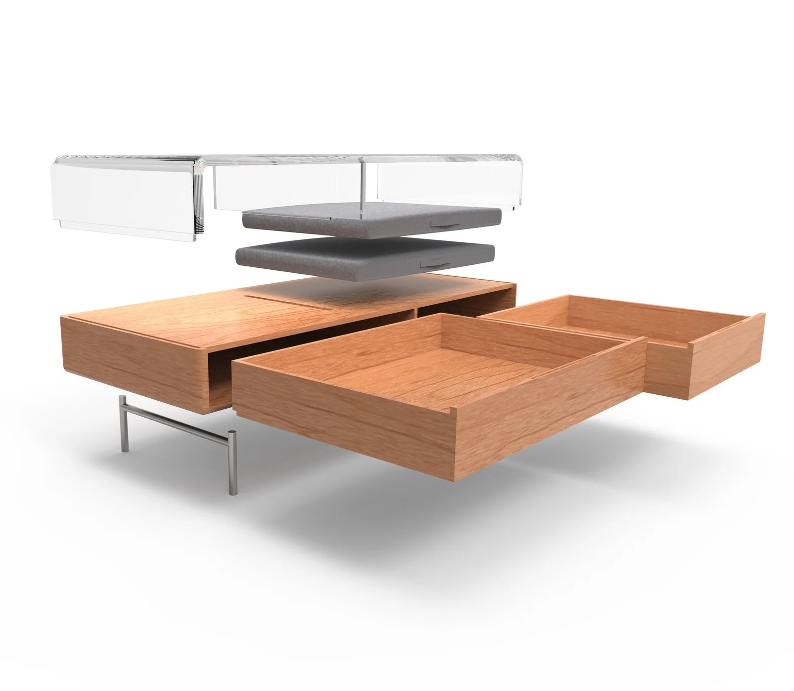
The Hio Coffee Table
Our Challenge _
Our task was to create a furniture line intended for small living spaces. We were instructed to target a younger audience and incorporate new materials into the lineup.
Thought Processes _
A coffee table
My decision to design a coffee table for this competition is based on its role in the living room space. It serves as the centerpiece of the living room, interacting with the user daily in formal and casual situations. In a small living space it has huge potential for storage impact. Many coffee tables forego the option of storage for aesthetic. I wanted to challenge myself by making use-able storage look visually light and appealing. Finally, a coffee table is arguably the best place to begin incorporating new and innovative materials into the home.
Small Environments
Our main concern with this project was being able to accurately understand the environment we were designing for.
We learned:
Furniture must be multi-functional and serve its purpose well.
Storage is Prioritized
Limited visual obstruction/ open spaces is best.
Main Objectives
Light | Inviting | Calm
In essence:
Reduce visual obstruction of space
Simple and elegant, complimenting any interior
Friendly forms and materials
Achieving Objectives
Acrylic
A transparent medium that opens visual space
Easily shaped and manufacture
Competitive material
Form
Soft forms by rounding corners
Proportioned for ergonomic use
Inviting character
Use-ability
Storage focused
Modular cushions
Simple interactions
Ideating
Physical Model Studies
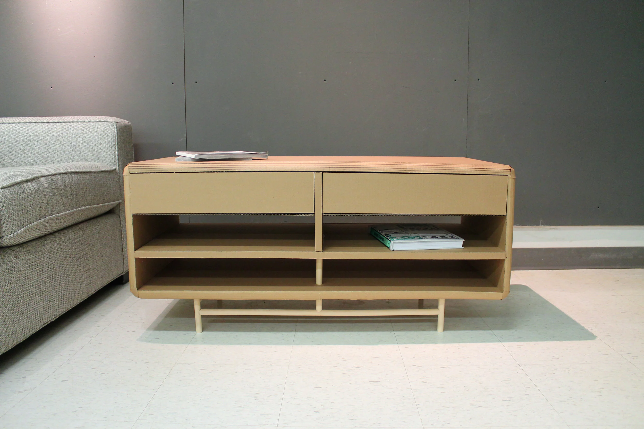
Prelim Model
Proportioned to be substantial for storage, and high enough for dining while sitting on the couch.
Bottom shelf to be constructed from acrylic.
Two drawers to store messier objects, and shelves below for throw blankets/books/games.
The set used similar leg design and contrasting proportions to tie pieces together.
Changes
Pieces should connect better through identity.
Similar shelf/drawer layout
Proportions
Accent material (acrylic) incorporation
Coffee table too tall
Storage needs to be more multi-usable (larger)
Too visually heavy
Aim for asymmetry
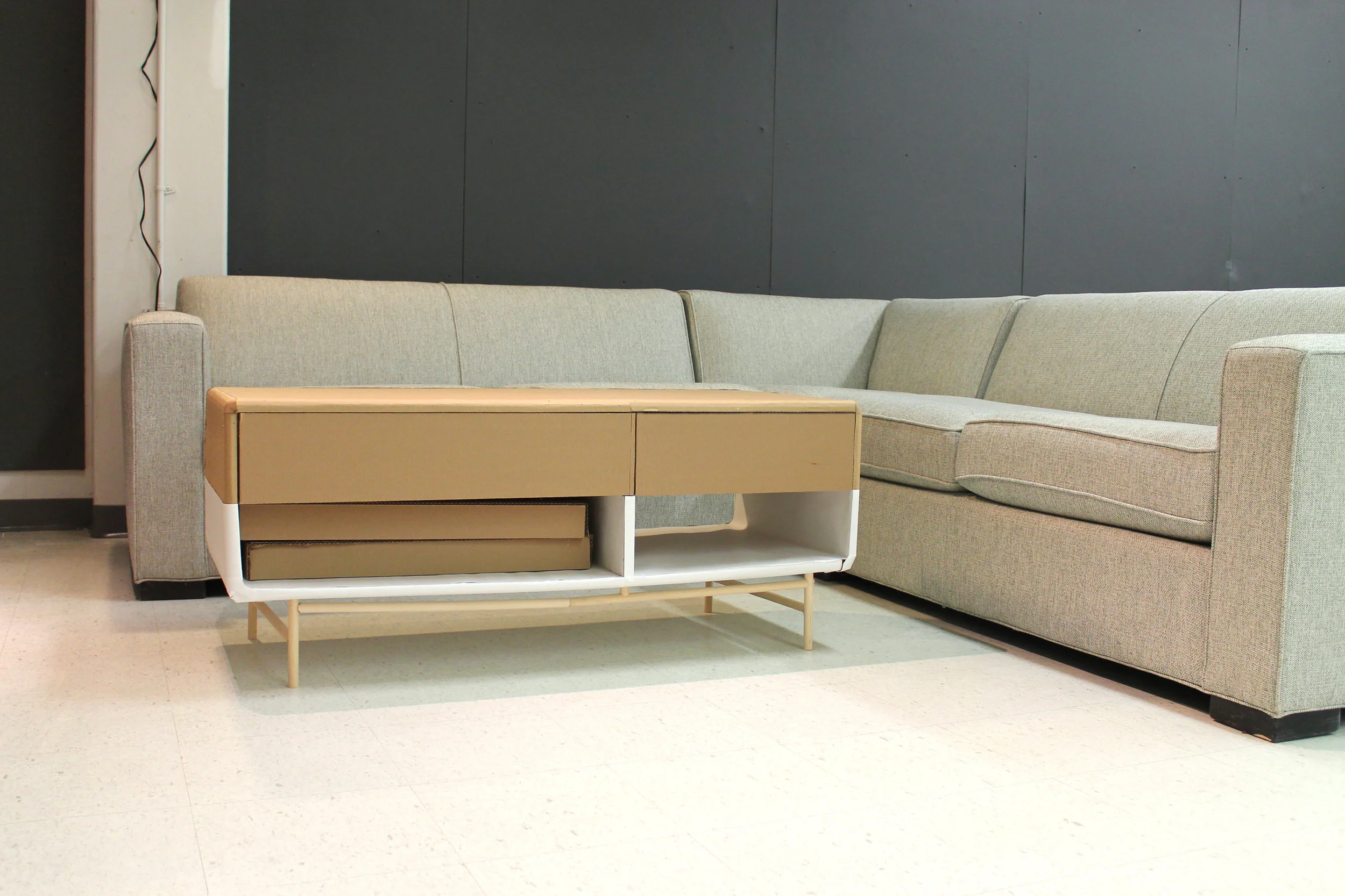
Revised Model
Proportion lengthened, changed to two levels of storage. Acrylic became a bigger/ signature part of the design. Visual weight lightened. Edges rounded for softer, inviting visual.
Optional floor cushions added to increase seating options for gatherings/floor lounging. Increased shelf space allows for sizable, generous cushion dimensions.
Larger, asymmetrical drawers accommodate large blankets and games. Height lowered slightly to fit a wider variety of couch/seating heights.
The set used acrylic accents with both pieces, showcasing it’s incorporation. Both pieces were lengthened and shortened, but given longer legs. Raising both pieces gave a loftier appearance and reduced visual weight from the first two models.
Changes
More major acrylic incorporation in media cabinet.
Flip acrylic to top of coffee table.
Shorten length of media cabinet.
Eliminate leg crossbars.
Flip cross piece on acrylic to create asymmetry.
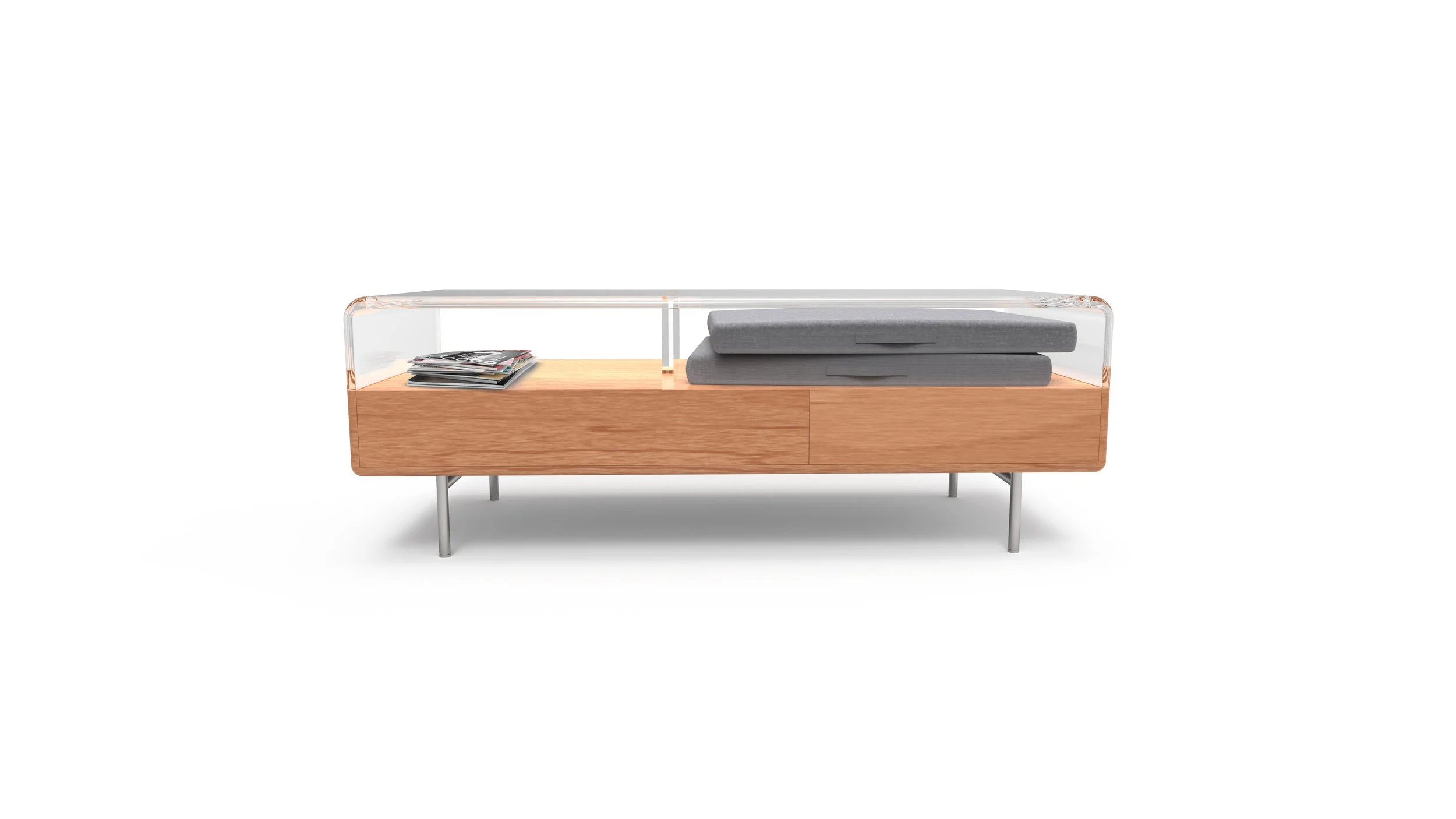
The Hio Coffee Table
Storage in mind | Seating for all
A purposeful footprint
Made for dinner and cocktails, board games and hangouts. It’s designed with a height and length suitable for dining and play from the couch or a floor cushion.
Show or stow
A clear acrylic top lets you show off your favorite board game, latest read, or throw. There’s two spacious, soft-close drawers that will fit extra blankets, remotes, toys, or clutter out of sight.
Minimal seating solved
Small spaces with limited seating is solved through two floor cushions. Each cushion has a wide footprint for easy lounging and nests perfectly in either of the larger storage compartments.
Collect all three
Or just pick your favorite. Coming in a variety of washes and wood types, the Hio coffee table vibes with a wide variety of styles.
The set
The Hio coffee table and media cabinet were designed to exist in sync. Both feature a beautiful, molded acrylic top and a dedication to usability. The media cabinet showcases and houses you favorite entertainment devices and the coffee table maximizes your ability to enjoy it. Together they provide a solution to necessity. Storage is ample, but not excessive. Table top space is usable with a flair. Most importantly, they minimize the visual space that they occupy, keeping your living space open and breathing.


